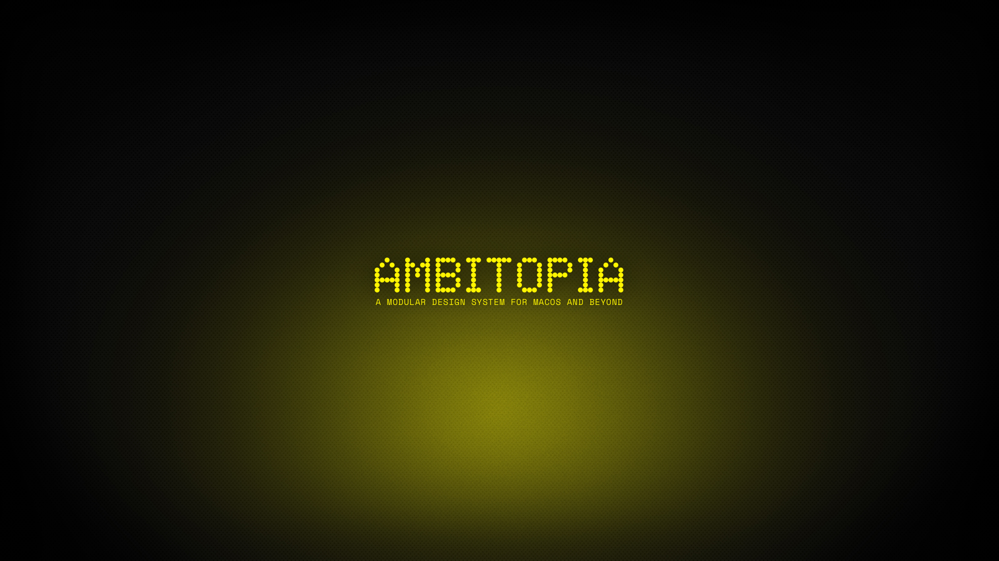
Ambitopia is a design system expressed through dotfiles and themes for macOS and built around a dark palette that caters to my accessibility needs with a nod to a cyberpunk aesthetic. I’m partially colorblind and dyslexic—for me, dark backgrounds with bright accent colors help me quickly locate important elements. I’ve used Ambitopia in relation to my work before; it’s a term coined by Redfern Jon Barrett to describe possible futures beyond the binary of utopia and dystopia.
It felt fitting as a title when I was thinking through my motivation for creating this design system: it was a response to Apple introducing liquid glass. When I saw it, I immediately knew I’d have a problem. The translucent, low-contrast aesthetic wasn’t just difficult for me as someone with accessibility needs—it felt oppressive. It’s so specific that it leaves no room to make it your own; it only allows different flavors of liquid glass. So I started this project as an experiment: how much of my computer could I reclaim? How much control would Apple actually allow me to have over my own workspace?
The resulting design system exists in the space between accepting Apple’s imposed aesthetics and fully rejecting their ecosystem. In those terms, the cyberpunk influence isn’t just visual flair; it reflects the underlying tension between corporate control and individual expression—it’s about creating a space of autonomy within systems designed to limit them.
The two color variants serve different sides of my creative practice. Yellow is used on my desktop where I do office and development work. Red is used on my laptop, which is almost exclusively for music production in the studio. Each environment gets its own accent color that greatly sways its feel in one direction or the other, while maintaining the core Ambitopia design system.